3 Ways to Make Your Writing More User-Friendly

Imagine this …
You’ve been hired by a client to write several pieces for an upcoming marketing campaign.
They want you to write a landing page, a sign-up confirmation message, a four-page report, and several emails leading up to a sales offer for a learning program.
You’re totally stoked. And then, they say this to you: “We want to make sure the copy is really user-friendly — that it delivers a great user experience.”
You always take time to get to know your audience at the outset of any project, so you’re confident you’ll know how to write in a way that resonates with your reader. But, you feel like the client is looking for something specific when they say “user-friendly” and “user experience.”
More and more often these days you’ll encounter clients who want to know you can deliver a good user experience for their readers.
Now, there’s a lot that goes into writing great-user-experience copy … but, you can improve the user experience a lot by doing three easy things. Make sure your copy does these three things, and you’ll wow your client. You’ll also improve the experience for your reader … and, in the process, you’re likely to get more leads and more sales.
Everyone is happy!
#1: Help your visitor get oriented immediately.
When your reader visits a website, clicks through to a landing page, or opens an email, they have an expectation in mind based on where they’re coming from.
Say, for example, they did a Google search for “how to plan the perfect birthday party.” They click a link that takes them to an interior page of a party-planning-and-supply website. What is their expectation?
Most likely, they expect to find tips for planning a great birthday party, right? If you immediately try to sell them a package of decorations, that’s not going to meet their expectations.
Likewise, if you’re writing a landing page, you need to know what the ad or email message said that’s brought them to that landing page. If they clicked a Google Ad with the headline “One-of-a-Kind Graduation Gifts,” the headline on your landing page needs to let them know they’ve landed in the right place.
“101 Graduation Gifts As Unique As Your Grad” would be a decent headline for that landing page.
“Get Them Ready for the Next Step” would be less good. It’s vague and doesn’t connect with the ad they clicked on.
Let’s look at some examples …
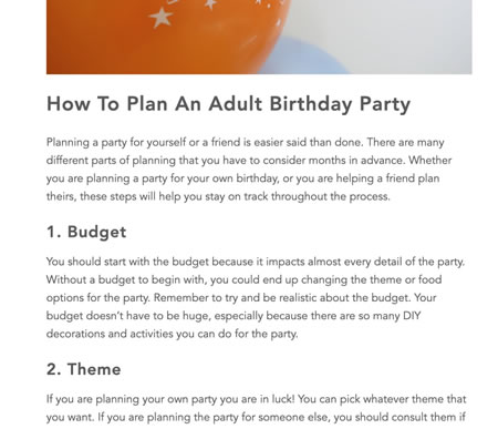
When I do a search on “How to Plan the Perfect Birthday Party,” the top result on Google is this …
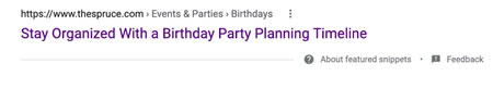
Now, that may not be exactly what I’m looking for based on my search term. But, when I click on that link, I get this …
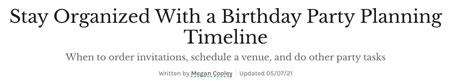
The headline matches the link I clicked. That signals to me I’ve come to the right place.
Your link and headline don’t have to match perfectly, but they need to be similar enough to leave no doubt in your reader’s mind they are where they want to be.
But, what if you want to plan an animal-themed birthday party?
Then you might click on this link …
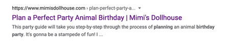
Which will bring you here …
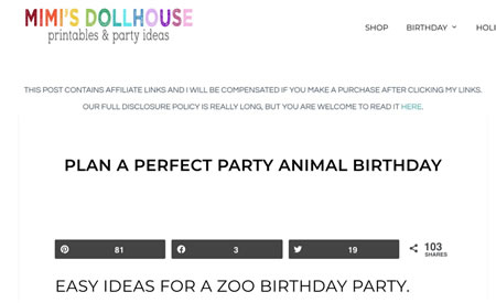
The headline matches the link, but the subhead introduces new information that may not align with the reader’s expectations. It might lead them to wonder, “Is this about planning an animal-themed party at home, or hosting a birthday party at the zoo?”
Which might send them off to find a different animal-themed party link to click.
If the Search Result link had said, “Easy Ideas for a Zoo Birthday Party,” that would have been a better match.
If your goal is to write user-friendly copy, then figure out the main purpose of the page and make it clear as quickly as possible. And then, make the different points of entry as clear as possible, too.
#2: Pay attention to formatting.
User-friendly copy is easy to read. It looks inviting.
One of the fastest ways to create that easy-to-read feeling is to give your copy room to breathe. Allow for plenty of white space. You may need to work with a designer on this, but bring ease-of-reading into your draft from the very beginning. It will show your client and their design team the effect you’re hoping to create.
Another way to make copy easy to read is to write shorter sentences and paragraphs. Use simple rather than complex words — as long as the simple word still captures your meaning.
Variety is also important. Short sentences, yes. But, if every sentence is eight words long, your reader will get bored. The same goes for paragraphs. Use mostly short sentences and paragraphs. But, include some longer ones, as well. And, some extra-short ones. It will give your copy a better rhythm.
Use visual elements to make your copy easier to read and engage with. Some visual elements you might use include …
- Scannable subheads
- Screen shots
- Pull quotes
- Bullet lists
- Charts
- Photos — Make sure they’re relevant, original (if possible), or they invoke an emotion that ties in with your copy.
Finally, pay attention to the flow of your ideas. Your copy must look easy to read, but it must also be easy to read. Good pacing and smooth flow are essential.
Let’s look at a page from Shutterfly. It uses lots of white space, large subheads, and short sections of copy to make this page look inviting …
Contrast this with a page on a similar topic from a party-planning store …
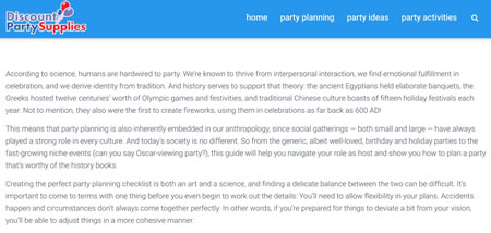
There are design elements on this page that could be improved, like the font size and the width of the copy. But, the writer could make this more inviting by including a headline, by varying the paragraph length, by adding a subhead after the second paragraph, and by making the writing a little less technical.
#3: Eliminate confusion.
No matter where your reader is coming from, they want to accomplish something. They may want to learn something … or buy something … or feel inspired … or be entertained.
None of those things is helped by confusion.
If you confuse a reader who wants to learn something, you’ll alienate them. They’re already confused or lacking information. Adding to their confusion will only frustrate them.
If you confuse a reader who wants to buy, they won’t. It’s hard to pull the trigger on a purchase when you’re feeling unsure about anything.
Confusion is not inspiring or entertaining, unless you’re deliberately creating confusion on the path to making a larger point.
Bottom line — you never want to inadvertently confuse your reader.
The best way to eliminate confusion from your writing is to do an editing pass with confusion in mind. Look for places where your words might have a double meaning, where you’ve left out helpful information, or where you’ve made leaps in logic.
When you find them, rewrite them to remove the confusion.
Writing that is clear and easy to read and that helps the user achieve their goals is writing that creates a good user experience. Keep these three things in mind when you write anything, and you’ll get better engagement from your readers and better results for your clients.
You can learn more about this from Heather and even learn how to become a Certified UX writer by joining AWAI’s new UX Copywriting Specialist live training.
This article, 3 Ways to Make Your Writing More User-Friendly, was originally published by Digital Copywriter.
The AWAI Method™ for Becoming a Skilled, In-Demand Copywriter
The AWAI Method™ combines the most up-to-date strategies, insights, and teaching methods with the tried-and-true copywriting fundamentals so you can take on ANY project — not just sales letters. Learn More »
I loved Ms. Robson’s clear examples and advice on writing “user-friendly” copywriting. Thank you!
Hi - Its ME –
This is very helpful! Thank you.
Janet Laird –